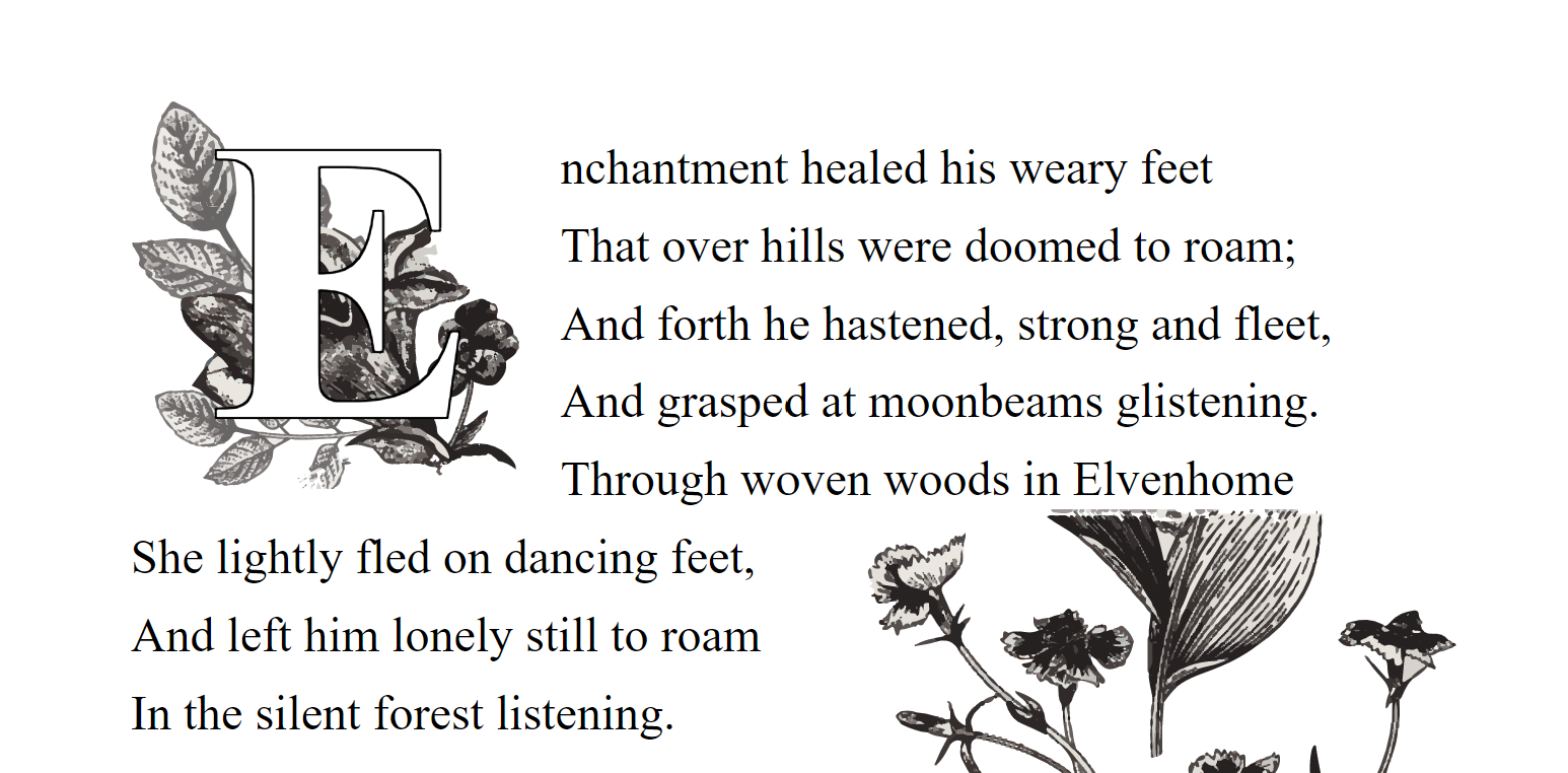
Drop cap
A piece of typographic flair added to the first letter of an important paragraph, often the first paragraph of an entire piece of writing (though not always).
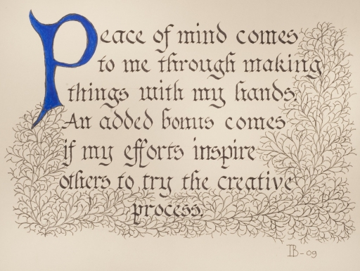
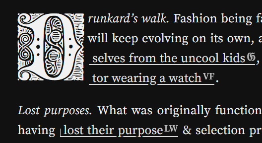
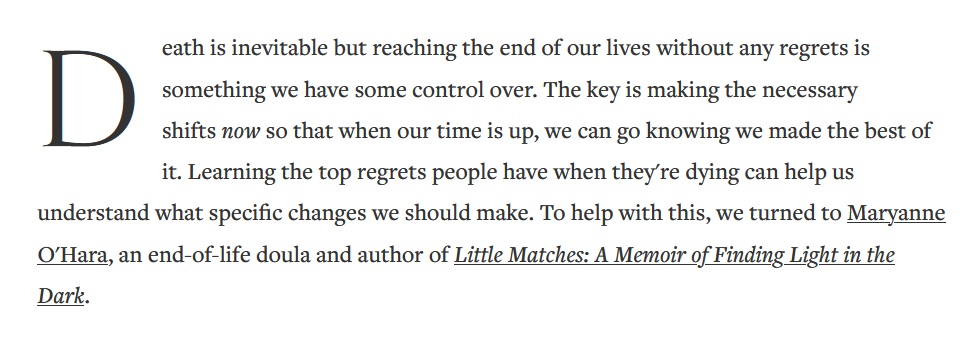
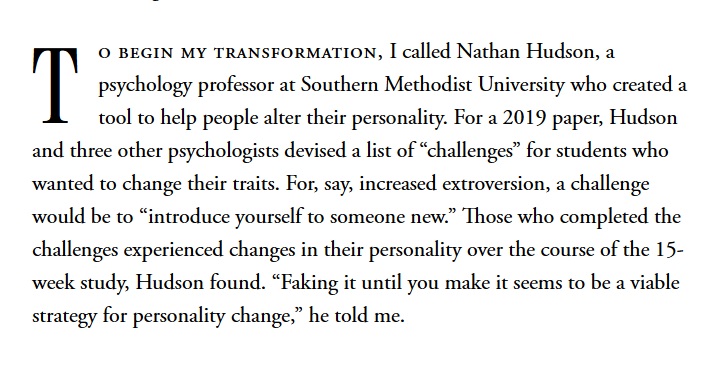
Pretty examples
Gwern Branwen has pretty drop caps on his website, but only on large screens.
Well and Good have a lot of padding around their drop caps
The MIT Press colours their drop cap the same colour as its logo:

The Atlantic uses a separate font, Atlantic Serif for its drop cap, and yet another font in small caps for the first stretch of words, Adobe Garamond Pro.
https://www.eviemagazine.com/post/elon-musk-permanently-bans-twitter-account-pedophilia-pride-flag-youth-attracted
Working with drop caps
Drop caps for web are generally implemented with the CSS pseudoclass, ::first-letter . Any browser dev tools should work for analysing drop caps on the web. Firefox's dev tools has them under the pseudo elements section.
It should also be noted that using :first-letter is best for accessibility. Other methods using an element wrapping the first letter cause problems with screen readers.[1]
Some browsers have introduced the initial-letter CSS property, which gives a reliable way to set the height of a drop cap. This allows large illustrated drop caps like above.
This is supported on Safari, Edge, and Chrome.[2]
https://blog.stephaniestimac.com/posts/2023/1/css-initial-letter/
Smashing Magazine Historical Use And Current Best Practices With CSS , 2012 April 4 ↩︎